
Eight typefaces we keep coming back to from the Monotype Library.
Brand fonts
Custom fonts
Font management
It’s no surprise that Monotype’s library is home to some of the world’s most beautiful typefaces. It includes dependable workhorses, expressive editorial faces, and timeless classics that have quietly shaped branding and design for decades. Whether you’re working on a design project, crafting a visual identity, or building a typography system, you’re likely to discover a few gems along the way.
In this post, our friends Hua Shu and Wenting Zhang at Typogram are sharing some of their favorite typefaces from the Monotype library and what makes each one stand out. Typogram is a typography-first web-based design platform. Typogram users can access more than 7,000 premium font styles from the Monotype library directly within the platform, eliminating the need to source, download, and manage font files separately.
Ogg Display & Text.
Ogg is a family with two complementary voices: Ogg Display, drawn by Lucas Sharp with Greg Gazdowicz; and Ogg Text, designed by Lucas Sharp with Connor Davenport, Wei Huang, and Kia Tasbihgou as its text companion. Both are rooted in the hand lettering of book designer and calligrapher Oscar Ogg, which gives the family a calligraphic backbone and a distinctly human rhythm.
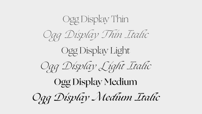
Ogg Display: Font weights and italics. Source: Ogg Display Typogram Studio Font Details
Ogg Display is expressive and high contrast, ideal for headlines, covers, and identity work where you want a serif that feels alive on the page. Ogg Text translates that same DNA into smoother, more restrained forms for body copy, so long-form content can feel distinctive without sacrificing comfort over many paragraphs. Together, they make a complete editorial system: one voice for the attention-grabbing moments, one for the sustained reading experience.
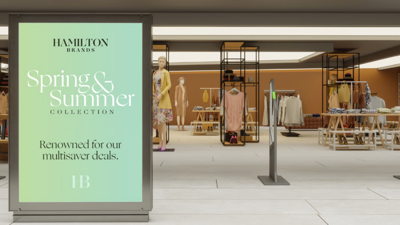
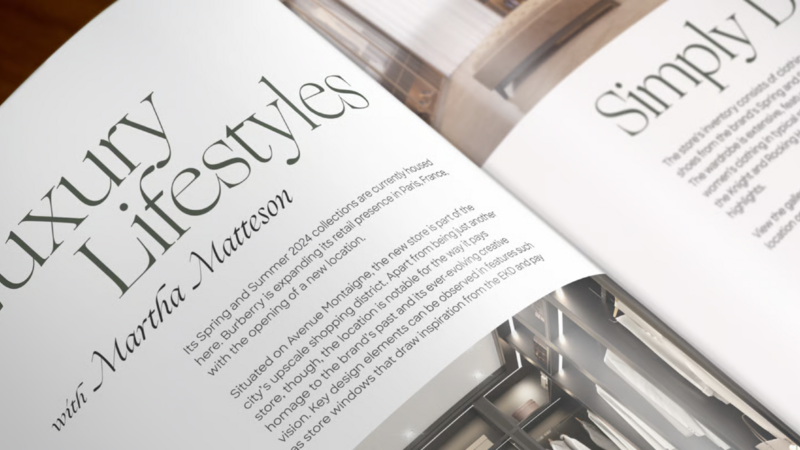
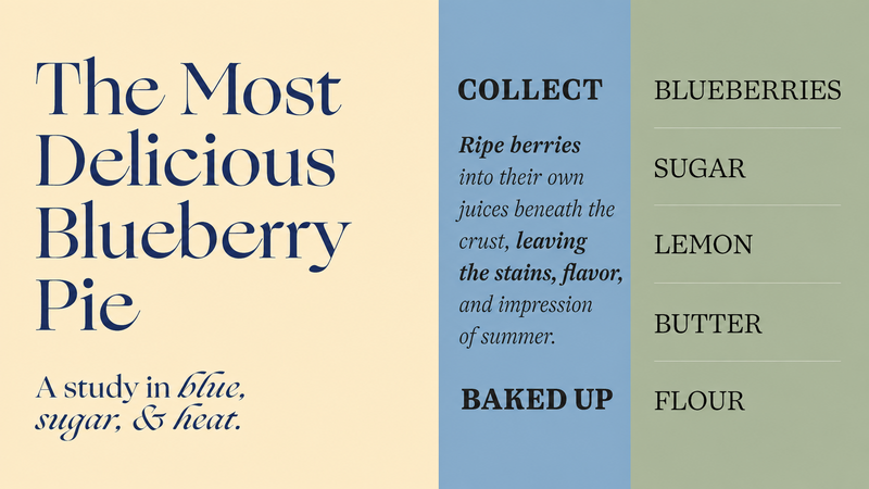
What we love most about Ogg as a family is the sense of craft behind every detail. The subtle irregularities and calligraphic influences give the typeface a human quality that feels carefully considered rather than mechanically perfect. The sharp stroke contrast makes the typeface feel elevated, especially in the display weight and italics. Ogg has a rare ability to feel sophisticated and editorial while still carrying warmth and personality, which is what makes it so memorable across both large-scale moments and everyday reading experiences.
Biennale.
Biennale is a geometric typeface designed by Daniel Hernández for Latinotype, with a strong character and a large x-height that gives it clarity across a range of sizes. Its geometric letterforms give it a contemporary feel, while details like the oversized round dot on the lowercase “i” keep it distinctive rather than generic. It is especially useful for branding, headlines, and interface-adjacent design where you want crisp geometry with a sense of approachability. Its range of weights and styles also makes it practical for systems that need flexibility.
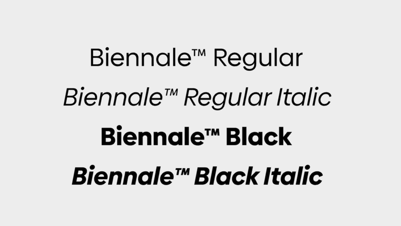
Biennale: Font weights and italics. Source: Biennale Typogram Studio Font Details(https://typogram.co/fonts/Biennale-tm)
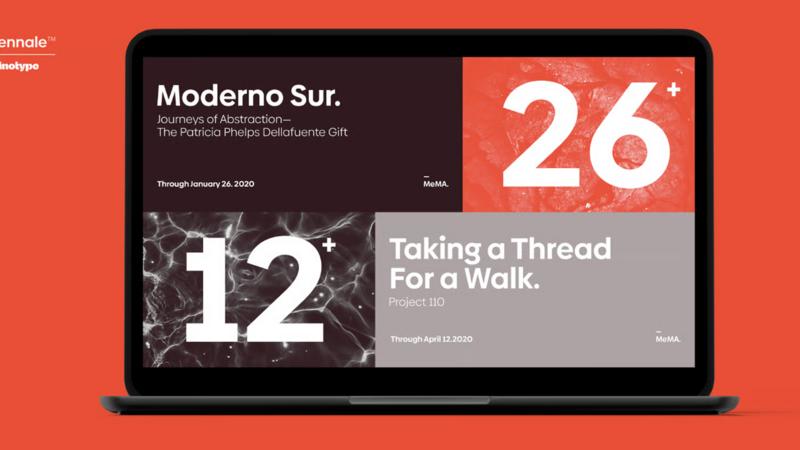
Biennale in use. Source: MyFonts
Our favorite part about Biennale is how it balances precision with a warm personality. The large x-height, carefully tuned spacing, and structured letterforms give it a strong presence without feeling overly rigid. Its clean geometric foundation creates a confident, contemporary impression, while subtle details add distinction and keep it visually engaging. Biennale feels like a typeface designed with both impact and everyday functionality in mind, making it versatile for bold brand moments and practical design systems.
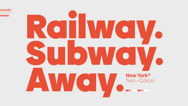
Biennale in use. Source: MyFonts
Futura Now.
Futura Now comes from the Monotype Studio, led by designers Steve Matteson, Juan Villanueva, and Terrance Weinzierl, as a definitive digital-era expansion of Paul Renner’s original Futura. The circles are still precise, the diagonals still feel decisive, but the overall system has been re-digitized and broadened for contemporary branding and screen use. Futura Now is a strong choice when you want a voice that feels architectural, optimistic, and unmistakably modernist. In the right layout, it can feel both timeless and newly sharpened.
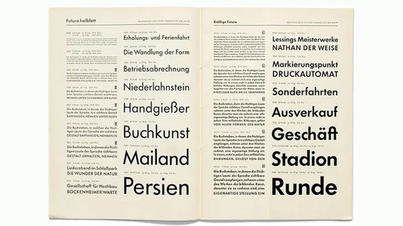
Paul Renner designed the “real” Futura, shown here, to “simply be what it is without any fuss.” Source: Monotype Blog
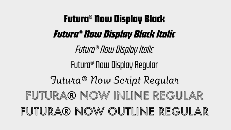
Futura: Font weights and italics. Source: Futura Now Typogram Studio Font Details
What makes Futura Now stand out to us is the confidence of a true classic paired with all the quirks of the original. Futura has always had boldness in its DNA: precise geometry, strong proportions, and an unmistakable presence give it an almost fearless quality. Futura Now preserves that iconic attitude while refining the system for contemporary use, showing how a typeface can feel timeless and modern while still keeping a little edge and variety.
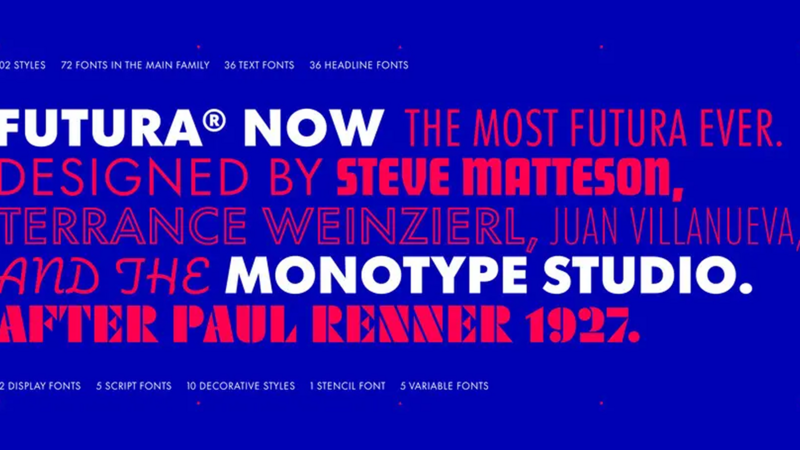
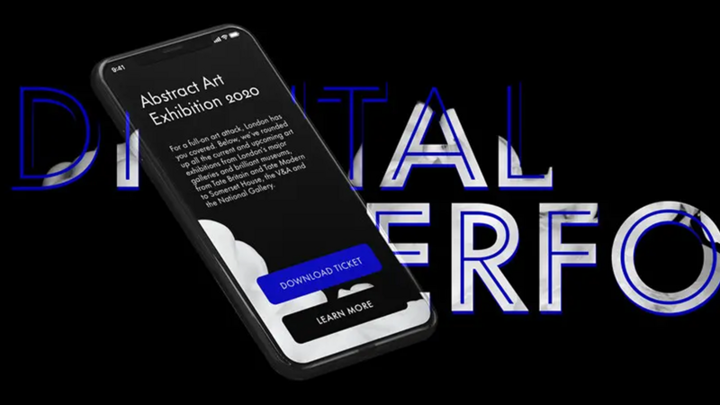
Futura Now in use. Source: Monotype
Gotham.
Gotham, designed by Jonathan Hoefler and Tobias Frere-Jones and published by Hoefler & Co, is a modern classic: clean, architectural, and exceptionally adaptable. Gotham was inspired by the straightforward lettering found throughout New York City’s urban landscape, especially architectural signage and the lettering of the Port Authority Bus Terminal. Rather than drawing from traditional typographic models, Gotham captures the practical, geometric language of everyday American environments, giving it a familiar yet distinctly contemporary voice.
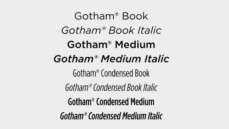
Gotham: Font weights and italics. Source: Gotham Typogram Studio Font Details
The typeface became widely recognized after its use in Barack Obama’s 2008 presidential campaign, where its direct and approachable character helped communicate a message of optimism, accessibility, and confidence. Its ability to feel both authoritative and welcoming made it a powerful choice for a campaign built on ideas of progress and unity.
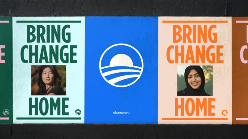
Gotham used by the Obama Foundation. Source: Monotype
What we love most about Gotham is its quiet confidence. It does not rely on exaggerated details to make a visual impact; instead, its strength comes from its proportions, clarity, and restraint. Gotham has a way of making any message feel more grounded and intentional, which is why it has become such an enduring choice for brands, institutions, and designers who want a voice that feels modern, trustworthy, and timeless. It has become one of those fonts designers return to when they need something confident and legible without extra noise.
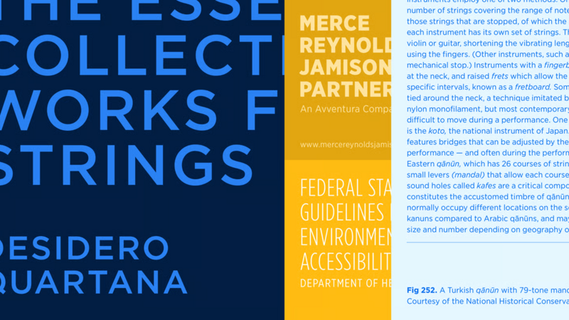
Gotham used in various styles and weights. Source: MyFonts
Avenir.
Avenir is Adrian Frutiger’s “future‑looking” answer to early geometric sans‑serifs like Futura and Erbar, created to keep their clarity while correcting what he saw as rigidity and reading fatigue. Frutiger wanted a linear sans in that geometric tradition that also reflected late‑20th‑century needs for better legibility and more organic, human texture on the page. The name Avenir (French for “future”) is a conscious echo of Futura, but the design deliberately breaks strict geometry: round shapes are made more oval, verticals slightly heavier than horizontals, and proportions tuned for smoother text color, all while retaining humanist details like the two‑storey “a” and the curled “t”. Frutiger later described Avenir as extraordinarily demanding to design and spoke of striving for “fonts with a human touch,” underlining how central that softer, human quality was to his intentions.
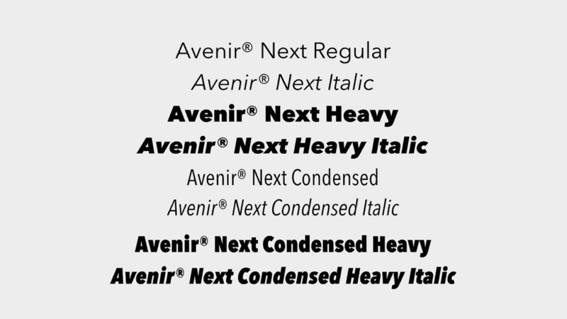
Avenir Next: Font weights and italics. Source: Avenir Next Typogram Studio Font Details
Designers respond to Avenir Next because it occupies a rare sweet spot: it reads as clean, contemporary, and systematized, yet avoids the brittle, overly rational feel typical of many geometric sans‑serifs. In practice that gives it an unusually broad usable range, from body copy to UI labels to identity wordmarks, all without flattening a brand’s personality or pulling visual focus away from the content. Compared to Helvetica, it has more warmth and rhythm, and compared to Futura, it feels calmer and more mature. This makes it ideal when you want a system that feels modern yet inviting, particularly in corporate identity, lifestyle brands, and clean web interfaces.
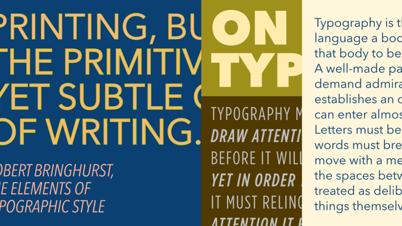
Avenir Next used in various styles and weights. Source: Avenir Next Typogram Studio Font Details
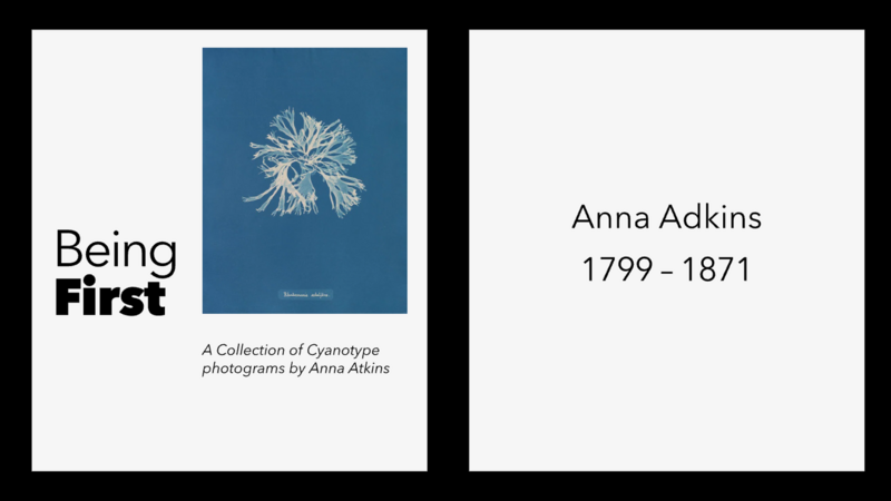
Avenir Next used in design mockup.
Helvetica Now.
Helvetica Now is Monotype’s contemporary redrawing of the classic Helvetica, created to solve the problems the original faces in today’s digital environments. It takes Helvetica’s core promise of clarity, neutrality, and versatility and adapts it to high‑density interfaces, responsive layouts, and global language support. Every glyph has been redrawn and re‑spaced, so the typeface keeps an even texture and open forms, whether it is a tiny label in a mobile UI or a large headline on a billboard. In practice, it feels like the Helvetica designers thought they were using all along, but with spacing, proportions, and details that hold up on modern screens.
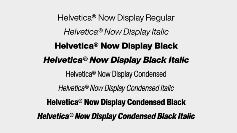
Helvetica Now: Font weights and italics. Source: Helvetica Now Typogram Studio Font Details
Helvetica, originally designed by Max Miedinger with input from Eduard Hoffmann, remains one of the most recognizable sans serifs in the world, and its endurance comes from consistency. Its neutral tone and message‑first character makes it a go‑to choice for everything from corporate identity to wayfinding systems. In the right hands, Helvetica can feel institutional, editorial, or quietly iconic, simply through changes in weight, scale, and spacing. Helvetica Now preserves this core personality while adding optical refinements and expanded character sets for contemporary branding and interface work, so the “Helvetica effect” translates cleanly into today’s media.
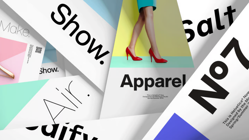
Helvetica Now used in editorial spreads. Source: Monotype
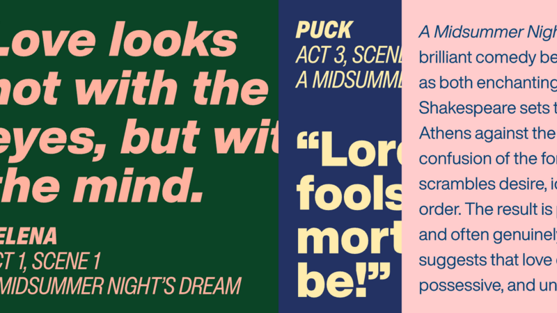
Helvetica Now used in various styles and weights. Source: Helvetica Now Typogram Studio Font Details
We love Helvetica Now because it has become a shared visual language: direct without shouting, familiar but not nostalgic, and strong enough to structure information while staying out of the way. Used well, it recedes just enough to let content lead, while still bringing clarity and order to the composition. Designers return to it because entire systems such as signage, interfaces, and editorial layouts can be built on its backbone without sacrificing clarity across contexts. Helvetica Now strengthens this foundation with size‑specific tuning and technical refinement, making it feel as dependable on a watch face or phone screen as it does on a book cover or airport sign.
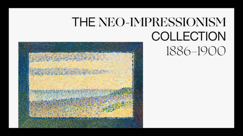
Helvetica Now used in design mockup. Source: Helvetica Now Typogram Studio Font Details
Benton Modern.
Benton Modern, originally developed at Font Bureau, began in 1997 with Tobias Frere‑Jones’s text designs for The Boston Globe and the Detroit Free Press, giving it a strong serif voice born directly out of newspaper and editorial typography. The series draws its form and proportions from Century Expanded, Morris Fuller Benton’s classic text face for American Type Founders from around 1900, with italics based on Century Schoolbook Italic. The result is a serif with more formal presence than many of its contemporaries, genuinely useful when a brand wants gravity without sliding into stiffness. Benton Modern inherits a confident, almost bookish structure while still feeling tuned for contemporary layouts rather than strict historical revival.
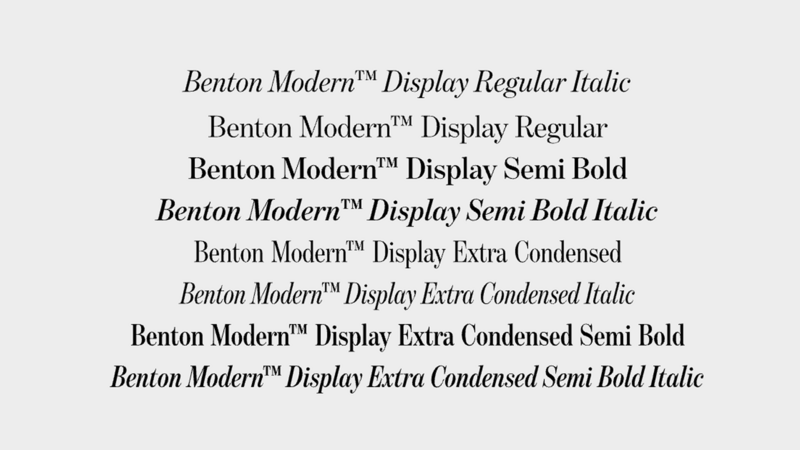
Benton Modern: Font weights and italics. Source: Benton Modern Typogram Studio Font Details.
Part of Benton Modern’s appeal is that it occupies that rare space where “serious” does not mean “stodgy.” Its forms are clear and robust enough to create hierarchy and authority, yet there is a quiet elegance in the way curves and contrast are handled, which keeps the typeface readable and visually calm. In a brand or editorial context, you can lean on Benton Modern when you need trust and heritage. It works well for universities, museums, cultural institutions, or high‑end packaging, without sacrificing the clarity and flexibility modern layouts demand. We love Benton Modern because it understands both the archives and the present, and it works especially well when a system needs to project depth, care, and longevity.
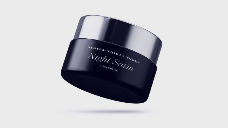
Benton Modern used in packaging design. Source: MyFonts
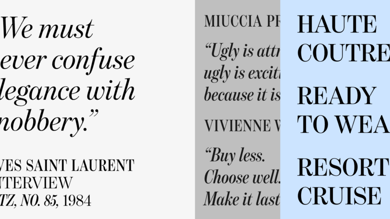
Benton Modern used in various styles and weights. Source: Benton Modern Typogram Studio Font Details
Obsidian.
Obsidian is Hoefler & Co.’s elaborately shaded display serif that takes 19th‑century copper plate engraving and map titles as its starting point, then rebuilds them using custom algorithms instead of hand‑drawn hatching. Designed by Andy Clymer with Jonathan Hoefler, it grows out of the earlier Surveyor family and the world of copperplate‑engraved maps, where decorative legends are rendered with dense shading and light effects to create a sense of depth. Obsidian spans two traditions at once: it mixes the handmade qualities of English vernacular lettering with the robust, high‑contrast proportions of “fat face” poster types, giving it a dramatic, dimensional voice that still feels grounded in typographic history. Because its highlights and shadows are computed rather than hand‑drawn, Obsidian produces perfectly rendered dimensional detail that would be nearly impossible to achieve consistently by hand. That precision applied to such an inherently analog visual idiom creates a compelling tension, making the typeface feel both crafted and uncanny, and all the more interesting and unique.
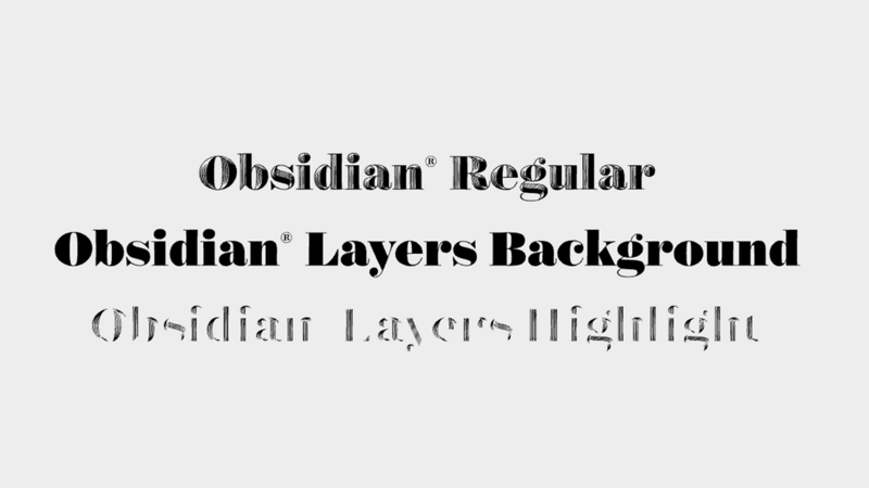
Obsidian: Font weights and italics. Source: Obsidian Typogram Studio Font Details (https://typogram.co/fonts/Obsidian-r)
In use, Obsidian shows how ornament can feel intentional rather than nostalgic. Its forms are intricate enough to reward close inspection, but the underlying skeleton, borrowed from Surveyor, remains clear, so words stay readable even as they take on a carved, almost architectural presence on the page. In practice, Obsidian works best when you need a headline or wordmark to feel like an object: book jackets, posters, packaging, or editorial openers where you want a sense of craft, history, and spectacle without slipping into generic “vintage” pastiche. It is a typeface that connects the copperplate archive with contemporary production, making it a natural choice for designers who want dimensional typography that still feels connected to the long lineage of engraved type and ornaments.
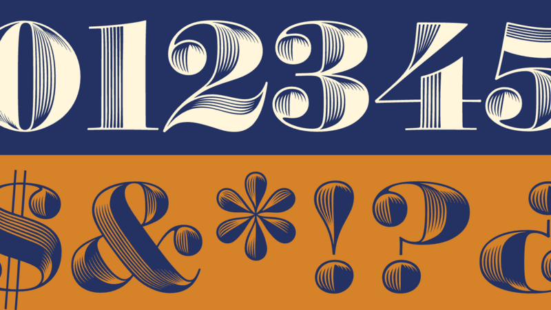
Obsidian type details. Source: Obsidian Typogram Studio Font Details
We also appreciate how Obsidian lets typography behave like an object in a layout. A single word or short phrase set in Obsidian can carry the weight of a cover, chapter opener, or label, which is powerful when you want the type itself to do the storytelling. Because its personality is strong without being theatrical, it pairs naturally with calmer sans‑serif or text faces: Obsidian handles the dramatic, high‑impact moments, while the rest of the system stays clear and contemporary around it.
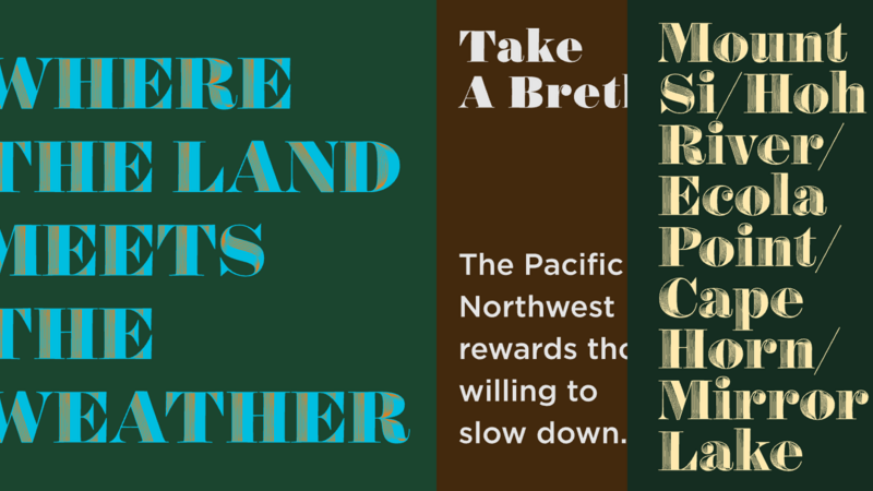
Obsidian used in various styles and weights. Source: Obsidian Typogram Studio Font Details
Browse 400,000+ fonts from more than 2000 type foundries.
Available now on Monotype Fonts.